Recently I had the pleasure of working in a meeting with a client in the technology space. I was pleasantly surprised to see a visual metaphor, or visual journey map, being used to describe their client’s journey from current to desired future state.
Why the surprise? I guess I hadn’t expected this group, who are primarily technology specialists, to use this type of tool to such positive effect. Note to self – must realign assumptions!
Many people often choose the visual journey map (below), which typically illustrates a path travelling from the current state on the left, to a desired state on the right. This works really well, is a good place to start if you’ve not done this before, and is easy to create on a large chart if you are leading an in-person meeting, or on an iPad or similar if leading an online meeting using a tool such as Mural/Miro etc.

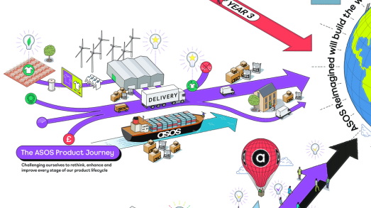
Why stop there? You may be looking for something different, or simply want a change. The good news is there are alternative metaphors you can create with a little imagination, pen and paper, or an iPad such as the examples below.

What visual metaphor could you use that aligns with your organisation or meeting context? Consider what your organisation does. What is its vision? How are images used within the business? It could be a transition to a green energy future, or maybe a transition from physical to online processes.
Whatever visual metaphor you choose, here are five practical tips for creating journey map templates.
- Identify headlines – Be clear on your headings, the most common are ‘Where are we now?’, ‘What are the barriers/risks?’, ‘What are the enablers?’ (things that help us to get to where we want to go), ‘Where do we want to be?’, ‘How will we feel when we get there?’.
- Sketch out – Using your notepad, sketch how your journey map might look before committing to a big sheet. This gives you a chance to work out proportions. When you come to draw out a final image, use light pencil lines first to ensure you have elements in the right place.
- Choose simplicity – To be effective, a visual journey map needs to be easy for the group to understand. Meeting participants who are confused about and distracted by the image are likely to have less productive conversations. Avoid adding unnecessary visual detail – even if your artistic inclination tempts you!
- Make space – Your journey map needs plenty of space for group inputs to be added. Use bigger paper (or tape flip chart sheets together) if there’s a risk that your image will become too crowded. Remember, not all parts of the journey map may need as much space as others. If your group will be adding sticky notes to the chart, go bigger to ensure the notes don’t flood the image.
- Add colour – A black line drawing will work, however a little colour will add depth and make the template more enjoyable to use. Soft pastels work well or a marker pen in a light shade such as yellow or light grey.
Bridge, air balloon and space template examples taken from ‘Meet with Impact – 40 visual tools for productive meetings and engaging workshops’, by Tom Russell, published by Pearson (2019). Available through the Inky Thinking shop (at a reduced price), Amazon, or your friendly local bookseller.
———
Content taken from ‘The Visual Meeting Coach’ LinkedIn newsletter by Tom Russell. To subscribe to Tom’s newsletters visit https://www.linkedin.com/in/thomasrussell/
About Tom …
Tom is a facilitator, graphic recorder and founder of Inky Thinking, a creative agency specialising in bespoke visual communication, enabling leaders and organisations to communicate effectively. Tom works with leaders and teams in global organisations to design and facilitate conferences, meetings and workshops. Inky Thinking are also a proud UK reseller of Neuland visual facilitation kit.


