There’s a moment that my heart rate increases every time I get ready to facilitate a meeting. It’s that point when I walk into a new meeting room for the very first time to discover what type of space I am working with for one or two days, or maybe even a week. Sometimes I even find myself closing one eye as I walk in. Is this something you experience?
Of course there are ways one can mitigate this sense of dread, such as actively advising one’s client on the best type of meeting room to hire, or asking for photos of the meeting room in advance so one knows what one is working with. Like estate agents, meeting venues can be masters at making a meeting room look very different to reality, which is why I make a point of requesting phone “snaps” rather than marketing images before the meeting, as the person taking the images is more likely to be “honest” in their photography.
Sometimes one just doesn’t have a choice. As the facilitator, it is one’s task to transform the space into a place where rich and productive conversation can take place, visually.
Here are 6 simple tips for creating the best possible visual meeting space:
1. Zone the Room – Aim to use different areas of the room for different activities. A change in perspective often helps participants to mentally separate different conversations, as well as providing a physical change. For example, try creating a space for “lean in” conversations and another for chart work. In a meeting last week one of the meeting participants commented on how great it was to use the whole room, ‘leaving our brain cells in different places’ (I assume in the form of insights on the charts).
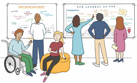
2. Picture it Possible – Don’t be afraid to have pictures moved. It’s reasonable to ask a venue if they can temporarily remove a picture or wall covering to reveal a usable working space. Remember to ask first rather than go straight ahead, as keeping the venue on side is a must.
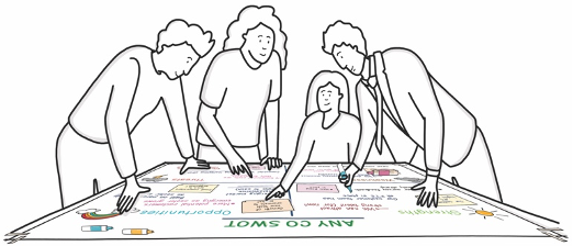
3. Paper the Table – If there’s an immovable table in the room, paper it. Use this space as an opportunity to create a flat visual working space, rather like a “war room” with the team gathered around to do their best work.
4. Create a Visual Journey – The wonderful thing about using charts of paper is that they can stay on the wall throughout the whole meeting, unlike the slide which will appear on the screen and then disappear. Use your charts to create a visual journey across the meeting, using previous charts as a reference point, for you and participants, as the work builds.
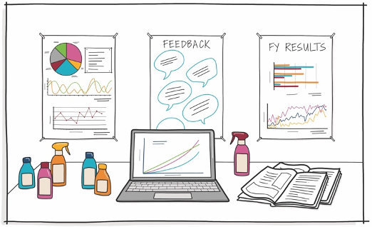
5. Set up a Knowledge Space – This is a place where participants can go to seek information which may be needed in a meeting. This might include posters, reports and other useful information. The knowledge zone enables participants to “get what they need” at key points in the dialogue.
6. Always Double Layer – If you are papering a wall ready for participants to write on, double layer the paper, especially if you are using permanent markers. There a few things more embarrassing that taking the paper down and finding that the work has seeped through to the wall. Think sustainably by re-using the base paper another time.
These are just a selection of tips that I have found very find useful. What are yours?
———
Content taken from ‘The Visual Meeting Coach’ bi-weekly LinkedIn newsletter by Tom Russell.
To subscribe to Tom’s newsletters visit https://www.linkedin.com/in/thomasrussell/
About Tom …
Tom is a facilitator, graphic recorder and founder of Inky Thinking, a visual communication agency specialising in bespoke visual communication, enabling leaders and organisations to communicate effectively. Tom works with leaders and teams in global organisations to design and facilitate conferences, meetings and workshops.
Tom’s book – ‘Meet with Impact – 40 visual tools for productive meeting and engaging workshops’ was published by Pearson Business in 2019.


